Part 3: Designing 101 (Designing My House Series)
Visit my NEW site Alexandra Eidenschenk Designs

If you haven’t read them already, please check out my first two blogs about buying land and finding inspiration for the design of my new house in New Marlborough, MA. This installment is about how I started to design the house from scratch – one of the most rewarding experiences of my life! Click on the images to enlarge them.
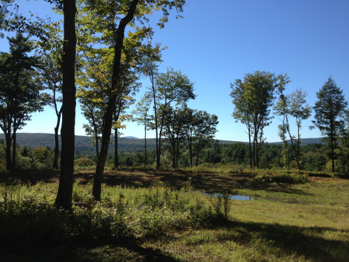 The number one factor affecting my design decisions was the incredible sunset view on the property I purchased. The most important rooms in the house, particularly the ones used most often, had to face the back of the house. I admit that this was a challenge to make work early on without the house becoming one long railroad of rooms. Of course a secondary factor was cost. Building is hugely expensive today and I want to build an energy efficient artisan home that marries form and function. In my mind, modest and tasteful is infinitely preferable to big and showy.
A traditional layout with defined rooms and flow is the cornerstone of my plan. I’m a bit more formal than others in my generation and I like the idea of public versus private spaces — like a formal entry hall, bedrooms on the second floor away from entertaining spaces, and a dining room separate from the kitchen. Each major room would need windows on at least two sides of the house to provide light and air flow along with adequate storage space. Wood burning fireplaces in at least the kitchen and living room were a must for both their beauty and practicality. And it was essential to maximize passive solar benefit from southern sun exposure. This is what early American settlers did. The longest and tallest side of a house generally faced south to take advantage of sunlight and warmth before electricity and modern heating was available. Nowadays it’s just good common sense due to the high price of fuel and the volatility of the global energy market.
 How to start? It’s not so hard to design floor plans in and of themselves but how do you translate them into well-proportioned rooms that flow? And how does a great interior plan convert to an attractive exterior? Well, the answer is simple trial and error. Because I did everything by hand on drafting paper, I spent almost a year running through many options until I found a basic layout that was workable from both a form and function standpoint. My twin sister, Cybele, and I spent a week at the Heartwood School in nearby Beckett, MA to learn hand-drafting (which is still my preferred method of designing) and it was one of the most amazing weeks of my life. Cybele and I had so much fun together and ever since that spring many years ago she has been an integral part of my house planning process. She’s eagerly awaited each and every draft revision and is interested in even the most minor details of the plan. Also, my friend and colleague Mike Erkkinen’s building expertise and love of classic architecture was invaluable in this design phase and he did the computerized drafting for me along with the construction plans. My boyfriend, Rich, joined the process later in the game but he’s since contributed to many changes, particularly with the chimney and fireplace designs (he is a former stone mason).
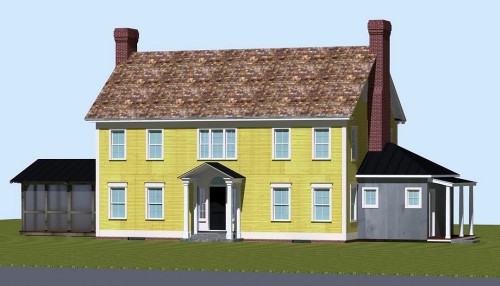
 As you learned in part 2 of my blog, my house is designed in the early Georgian style. It will be built out of wood (framing and clapboard) with brick as the masonry for the chimneys and foundation veneer. In lieu of interior chimneys which take up a lot of precious space, my two chimneys will be positioned on either gable side wall, graduating from 6’ wide at the base (1st floor) to 4’ wide above the roof line. This is practical because the fireplace openings will get smaller as you go up each floor and because it saves money on materials. The ceilings will be relatively low (7’6”) and the windows sized accordingly — about 2’8” wide by 5’ high on the first floor and 2’6” wide by 4’6” high on the second floor. I’ve always loved the intimacy that low ceilings offer in old houses.
The house is essentially a rectangle measuring 28’ deep by 42’ wide with a small jut-out in the back for the dining room and two telescoping attachments – one a screen porch and one a mudroom. Although the house has five bedrooms (three on the 2nd floor and two on the 3rd floor), it is a relatively modest size (about 2,400 square feet on the first and second floors combined) in keeping with New England’s traditional values of efficiency and restraint. 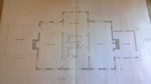 Other people might build a bigger house, but I’d rather have one that is small – at least by contemporary building standards – and beautifully hand-crafted down to the last square inch. In order to keep costs down, the mudroom will be built on piers rather than a foundation and it won’t be heated as part of the main structure.
While the telescoping additions to the main structure are not symmetrical, they are balanced in terms of size and proportion to the house. The screen porch boasts a shallow gable roof and the mudroom has a three-sided hip roof with a covered porch attachment. I love the interplay of roof lines on this house – each one is slightly different giving a bit of character to the façade. The porch roof is a little lower than I would like but it’s designed this way to maximize the southern sunlight into the master bedroom above and the view seen from the bedroom windows.
The gable roof is pitched a bit more steeply than you would see in an authentic early Georgian house. This is to reduce snow load but also to get livable square footage in the attic. From a looks standpoint, I would have loved a hip roof on this house but that plan did not offer enough headroom on the third floor based on the house’s relatively small footprint. With a gable roof, a shed dormer can run across the entire back side of the house to give me two extra bedrooms and a bathroom. Many people questioned my decision to finish the third floor which they claim I won’t use as I get older. Well first and foremost, I plan to be able to climb stairs well into my 90’s! More important, the third floor will have the most glorious views in the house. Why not use space that essentially already exists under the roof line?
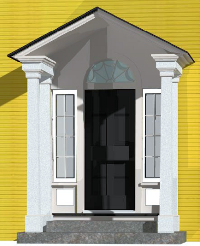 The entry porch is classically Georgian with a fan window over the door and sidelights on either side. The three-piece window above the front entry is exactly as wide as the front entry opening. I would have loved a Palladian window above the front entry (see my blog about Palladian windows) but it looked too squat on this design. Fenestration – the size and number of window openings on a façade — is another main element of house design and I worked hard to get it right.
You will notice that there are more windows on the west (back) side, in order to take advantage of the beautiful mountain views, and on the south side, to maximize sunlight exposure. One of the most whimsical elements of this design is the small cupola on the dining room roof which faces west. 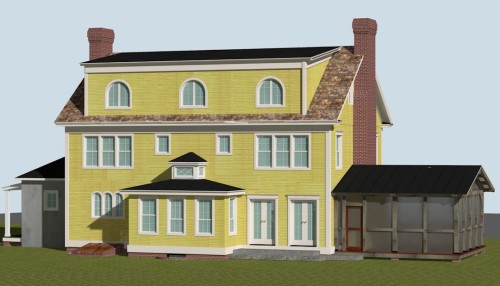 I’ll talk more about this in a later blog on interior design. The north side mudroom wall will most likely be used for wood storage and windows are limited on this side. As in typical Georgians, the east (front) façade is the most restrained and symmetrical.
A benefit of designing a center hall Georgian colonial is that it offers many options for future expansion. Although I don’t need or want the extra space, a family who purchases this house in the future will likely want some sort of large family room which could easily be added where the mudroom now exists (or on the porch side). 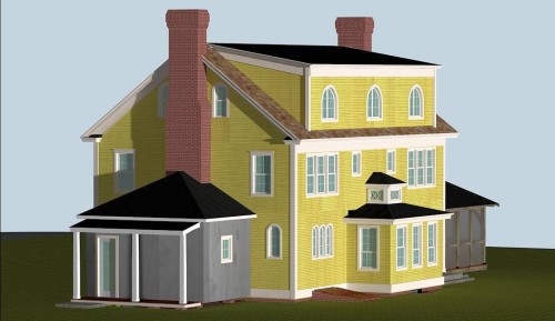 Unfortunately an addition off the back would be impossible because the property starts to slope steeply about 25’ from the back wall. I plan to build a barn/garage (see future blog) which has guest space on the second floor and my 36-acre property offers plenty of space for a guest house if needed.
The main house roof will be made of hand-split cedar shakes. It’s expensive to install them but you just can’t beat the authentic early American look. The jut out and cupola, entry porch and telescoping additions will all have standing seam metal roofs, probably in a charcoal color. This is a great choice for New England’s cold wet climate particularly on the north side of any building where the sun doesn’t melt the snow very quickly.
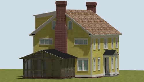 The colors you see in these 3D renderings are for contrast only. I love the color yellow but not this bright on an exterior! The porch, whose dark posts and screens look somewhat menacing here, will be stained to match the house’s trim. Color choice will be a subject of a future blog but currently I’m leaning toward mustard-colored clapboard and off-white trim. The mudroom dependency will look different from the main house by reversing the clapboard direction from horizontal to vertical and by staining it a different color.
Window design is such an important part of any architectural project that I decided to focus my entire next blog on that subject. I hope you’ll stick with me.
